(Summary in Japanese)
たった1日でマルチデバイスに対応したウェブサイトを作る方法
どんな業種でも、新しいビジネスを始める上でその基盤となるのがメッセージ性の強いウェブサイトです。製品、会社、そしてブランドについて発信をするプラットフォームとなり、製品や会社について知らない人にメッセージを届け、顧客や熱心なファンになって頂くためのツールとなります。資金がないけれどもローンチの遅れが致命的な損失につながりかねないスタートアップにとっては、特に重要な命題です。
このブログでは、最適なツールを使いながら、1日でウェブサイトを立ち上げる方法を伝授します!
成功への秘訣は下記の3つのステップです。
STEP1 まずはしっかりプランニングしましょう。考え抜かれたプランがあれば、間違いも少なく、修正をする時間もかかりません。
STEP2 ベンチマーク先をみつけ、良いと思うサイトからも学びましょう。DIYで、自分で撮った写真や動画も活用しましょう。
STEP3 レスポンシブ対応のCMSを使い、プラグインも活用しましょう。ソーシャルメディアやオンラインショップ、メーリングリストと連携させることだって可能です。
上記に加え、学ぶ姿勢というのもやはり大事です。大きな構想を持ちながらも、できるところからやってみる。そして、わからないことがあればGoogle検索してみたり、You Tube、Lynda.com、Wistia、Hubspotなどのチュートリアルを見てみる。私もそのようにしてウェブサイトを最短で1日で作りました。私にできたので、あなたにもできるはず。ぜひやってみてください!
(Main text in English)
The foundation of any entrepreneurial journey is a strong website. That’s where you start to spread the word about your product, your company, your brand. It is the key to converting strangers into engaged fans and customers.
In the present time, when launching your website a day later may result in a big market loss, it is essential to act fast and often rely on no-one else but yourself. You don’t have to be an expert in all aspects of web development but knowing the fundamentals can help you big deal when you are short on both time and money.
Building a website used to require a lot of technical know how. Many still believe it does and fail to launch their own online presences because they fear they don’t have the right skills and resources. Nothing could be further from the truth. When I just started working in IT industry in 2000, I had no choice but to learn HTML, CSS, Java, Flash and Perl. Nowadays, all you really need is the access to the Internet that is abundant with great tools and great knowledge hubs that can help you solve almost any kind of problem.
So with a little guidance and knowledge of the steps to take and tools to use, anyone can plan, build and launch their own website in as little as one day.
SO WHAT DO YOU NEED TO LAUNCH A GREAT WEBSITE IN 24 HOURS?
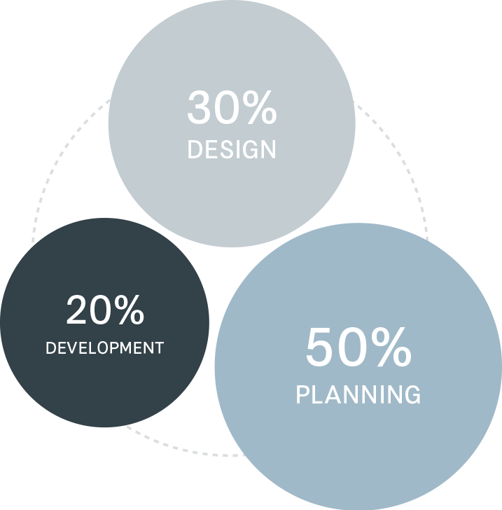
You need three things – a great plan, great content and great tools. And spending half of your time in planning stage is more than reasonable because having access to great tools like WordPress doesn’t guarantee you a great website. It just guarantees you a simple and fast implementation of your great plan and this is what you need first and foremost, a great plan.
IF YOU FAIL TO PLAN, YOU PLAN TO FAIL
It happened to me a couple of times. I have been so excited about some idea that I would dive in without making a plan first. There were other times when I would succeed at launching a great looking website only to find it months later providing no results whatsoever.
So what is a great plan? It is your essential roadmap, something you can go back to if you happen to get lost. It is a plan that answers the following questions:
- What is the purpose of your website? What are you trying to achieve?
- Who are you designing for? Pokemon Go players? Engineers you want to hire? Mid 30s office ladies with shopping addiction? Tourists wishing to explore Permaculture in Japan? Be specific. Build your user profiles and behavior scenarios. How do they browse the web? Using smart phones or laptop PCs? What media are they reading? Which social networks are they using? Do you want them to share your content? Comment? Subscribe? Download?
- Your next step would be to think about your content strategy over time because you don’t design your website so that you can forget about it once it is released. You need to think of the plan on how to maintain it, keep it fresh. Maybe you want a blog. Maybe you want to write two articles a week. How about social channels? Does your business need an Instagram? Facebook page? Twitter account? Think about how to divide your content across multiple social channels. And what about a mailing list? Perhaps, you should also think of your SEO optimisation strategy.. Sounds overwhelming? Don’t overthink it. Just keep in mind, your website is an ongoing project. Take it one step at a time. ^-^
If you can gain clarity on these questions, it will help you make your decisions much faster and faster is what you are after and the results will turn out to be way better.
AND NOW YOU CAN START THINKING ABOUT HOW TO PRESENT YOUR CONTENT
There are three things that you should aim at regardless of what kind of website you are designing.
- Simplicity
- Transparency
- Approachability
Whenever you are trying to present something to someone, it is important to stay on point. Having a huge amount of information, tricky navigation and complicated designs can drive away even the most patient users. Plus, simple is always easier and takes less time. Keep your layouts simple, uncluttered, your navigation easy to understand with minimum of clicks. Make sure your website is quick to load because no modern user will wait for your images to load however cool they are.
Be transparent. Don’t hide behind stock images and generic phrases. Let your users see your real face, hear your own voice. Let them reach you through your social media channels. Let them read your blog where you post real stories, real pictures even if they are taken with your smart phone. When I was discussing corporate culture with a friend of mine, CEO of a tech company, he said that he gets a lot of feedback from potential hires and clients about how much they enjoy reading his company’s blog where he posts reports and snapshots of their daily meetings, corporate get togethers and learning sessions. Their users really appreciate the honesty behind those blog posts. By being transparent, valuing your own voice and your own culture, you are opening a real dialogue with your users. They feel connected to you.
Approachability is a variable from transparency. In your attempts to look and sound professional, try not to overdo it. Choose the language that reflects your personality. Don’t try to sound smart and use terms only a few can understand. Let your users reach you through multiple inbound channels. Let them feel like they can contact you any time, if only to ask for directions.. Try not to sound as if your sole goal is to sell them something. Replying in time will also be a good plus to your image.
When thinking about site architecture and layouts, start with benchmarking. There is no shame in seeing how other great sites work and taking something from them whether it is an interesting use of visuals, easy to understand content grouping or an eye-catching layout. When we are children, we learn our new skills by observing the world and copying people around us. We repeat what they do till we are confident enough to make our own moves.. And benchmarking is a great way to learn and it saves you a lot of time. Everyone benchmarks. Your are doing it, your competitor is doing it, the professional designers you wanted to hire are doing it.
So go on and pick the websites that reflect your aesthetics, layouts you find smart and intuitive, menus easy to navigate and maintain and see what can be applied to your case.

And now you are ready to start drawing. Forget those online wireframe tools. You are on the go now and the old-fashioned pen and paper will do just fine.
Decide on your website’s template, something that will stay the same on all your pages (your logo, top navigation, footer area, call to action and social media buttons).
Think of your sitemap (how are you going to divide your content into pages), make sure to come up with easy, intuitive titles for each page.
Now, think of the most important content, something you absolutely want your users to see and put it on the top page. And remember, you only have about 5 seconds to grasp their attention so make sure to put extra effort into designing your top page.
Avoid adding unnecessary content like built-in Google maps. Let your user click on the link and go directly into Google maps app to check your location. Don’t treat them like dummies by explaining too much and providing too many functions. Think minimal.
You don’t have to create separate layouts for the mobile version of your website. There are tools like WordPress that will do the job for you.
Here are some DOs and DON’Ts of visual and textual content presentation.
Let’s start with the things you should do.
DO USE
- Plenty of space when creating layouts for your content. Give enough room for each block so that it is more noticeable and readable.
- Relatively large images that you can resize later based on your needs. Photo editing software can help you tweak the weight of your images without compromising on their size and quality. I use Adobe CC and I always save my biggest photos (for hero areas and parallax backgrounds) with the size of around 1400px and with JPEG quality down to 60%. It is still a great image but it is also light. There are plugins that can do image optimisation for you as well.
- Set your default body text to 15-18px. That’s how big things got these days. Bigger fonts – better readability across all devices.
- Save your icons in double the size to cater to retina displays or better yet, use web font icons.
- Regarding photos – your own are almost always better than stock. It’s not that difficult to take great photos or even videos by yourself. DSLR camera is great but smart phone will work too. Go to YouTube and search for Exposure triangle and Photo composition tips. It will help you get out of the auto mode and start shooting in manual or priority modes. Your images will improve right away. Mine did, only after 30 minutes of Lynda.com tutorials. ^-^
- And If you don’t know it yet, you can make your own videos as well. Animated explainers have never been easier with tons of online services like GoAnimate. And if you want to shoot your own promotion video, that’s fine too. Check learning centre by Wistia.com. I have made my first corporate video entirely based on their short video tutorials.
- Try to stay consistent in style across your website. Your headings, colours, graphics should look the same.
- Don’t be afraid to tap into Creative Commons – shared resources that you can use freely under the Creative Commons license. In most cases, it usually means crediting the creator of the visuals you are using. There are tons of free icon sets, mockups, illustrations, photos out there and a lot of them look amazing.
- Web type tools like Adobe typekit and Google fonts are great in helping you enhance the visualisation of your titles and important messages. There are plenty of cool looking websites out there that use nothing but typography for their visuals. And buying some great web fonts won’t break the bank. I chose my company’s corporate web font on myfonts.com and it only costed me 4000 yen.
DON’T USE
- Wide horizontal graphics, especially if they are text-rich. Imagine them resized to a tiny stripe of an image on mobile devices. The text won’t be readable and you will lose balance in your layout right away. In general, try not to put too much text into the graphics.
- Generic stock images. If you have no opportunity of taking your own photos, try to choose your stock images that are a little bit more organic. Instead of people posing on a white background, focus on scenes that look natural. It will help you avoid losing your personality and making your website look like hundreds of others.
- Sidebars. They were created to improve usability but the opposite is actually taking place. They tend to clutter websites with extra navigation and endless banners.
- The same colour for your text and for your links. Make your links look different from the rest of the text. This rule exists from the 1995 for a reason!
- Long paragraphs of text. Think in 140 characters or less. Divide your text into little Twitter blocks to increase readability. A wall of text is likely to be ignored. Nobody has time to read it.
- Now, writing interesting content is not easy. Not everyone is a natural born copywriter. But it is important not to let it stop you from releasing your website. Brainstorm with your team members, friends, family. A Dentsu copywriter once told me that his clients are generally very creative and often come up with better slogans than a professional. In my company, text copy is often the product of collective thought. So trust yourself. Even if your copy is not perfect, at least it is honest and that’s what matter the most.
- Now, that you got some tips on content creation, we come to the most interesting part – putting things together.
Putting things together
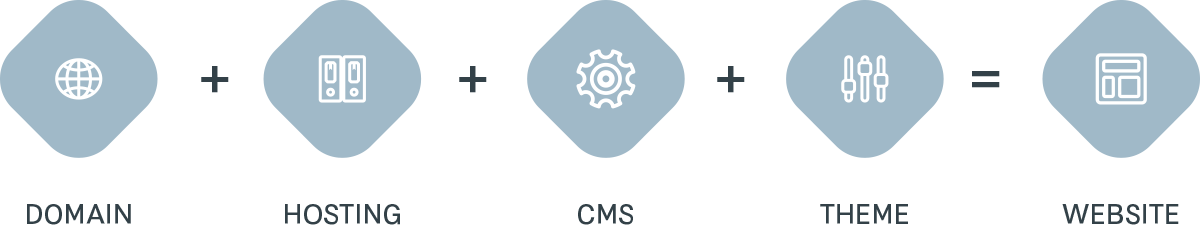
Your first step would be to register your domain, find the right hosting and the right CMS (website management tool that helps you build and maintain your website without knowing how to code). There are many choices out there but I find myself using Bluehost with its free domain registration and 1-click WordPress installation time and time again. It’s just convenient. It’s super fast, cheap and the customer support is great! And with the introduction of WP Bakery Page builder plugin, now you can create your websites in a what-you-see-is-what-you-get mode. You don’t have to even look at the code behind it.
You are also welcome to try Squarespace or Wix or Webflow or any other website building service out there. They are all free to try and they are all good depending on your goals. I just personally prefer WordPress because I like having it both ways – building websites without code and adding custom code to twist my sites to the perfection.
Once you install your CMS, in my case WordPress, your next step would be to find the right theme for you. A theme is a pre-made website that you can edit by adding your own content to it. There is a vast number of free and fee-based themes out there. Not long ago, you would have to browse through catalogs and choose the theme based on how it looks, whether it has mobile support, whether it matches your layouts. Modern themes are different. I call them monster themes. A single monster theme is capable of creating thousands of variations of websites. You can tweak layouts, styles, colours, fonts, visuals. You can create complicated sliders, campaign banners, page sections, store fronts.. The possibilities are endless. Plus, they look beautiful across all devices and they often come with some of WordPress most powerful plugins and built-in icon and graph libraries.
I have two favourite themes that I use time and time again. Jupiter theme by Artbees and Total theme by WPExplorer. These themes are amazing.
Just look at some of the websites you can create with these. They aren’t free but they aren’t expensive either. For 7000 yen you can purchase a monster theme that is integrated with everything you’ll ever need.

So find your theme (themeforest is a good place to look), install it and get yourself familiar with the interface of WordPress dashboard and Theme’s customisation panel. It’s very intuitive but if you are dummy like me, each theme comes with a great tutorial library that has short problem-based tips, videos and a great support ticket system. Youtube has tons of tutorials on WP Bakery Page Builder as well as Revolution slider, Woocommerce and many other great plugins that come integrated within the theme.
It sounds a bit overwhelming at first but only after 1 hour of step by step tutorials I have already found myself building beautiful pages with parallax backgrounds, page sections and versatile web font icons and they looked great on both PC and mobile screens.
And if you are like me designing your website in a tight timeframe, keep the number of your pages to the minimum. Perhaps, it is better to keep all your content in one page that your users can scroll through and get all the information at once. It certainly is convenient especially if your users are mainly browsing with their smart phones.
SO HOW TO DESIGN AND LAUNCH A MULTI-DEVICE WEBSITE IN ONE DAY?
Step 1. Take time to save time. Plan your website thoroughly. It sounds counterproductive but in fact it is a big time saver. You will make less mistakes and spend less time fixing them.
Step 2. Benchmark, borrow, DIY. Learn from other great sites, tap into shared resources, take your own pictures and videos.
Step 3. Use CMS, responsive themes and plugins that can help you connect with your social network, open an online shop, design and run a mailing list and so on.
And above all, be eager to learn. There is a lot involved in the process of planning, building and maintaining a website but it is important not to let it overwhelm you. Keep big picture in mind but start with tiny steps. Google your questions, read tutorials on YouTube, Lynda.com, Wistia, Hubspot. Use the shared expertise to gain the necessary knowledge. This is how I build my websites alone, sometimes in as little as one day. And if I can do it, you can do it. Don’t take my word for it. See for yourself.